
The references to source files and binary offsets you'll see here are the provenance of each claim: they say where it comes from. The engine is published under GPL-3.0-or-later at github.com/kokoima/openu5, so you can go and look them up one by one.
2 · Layouts
Which layouts the port offers, what each is for, and what it costs.
The screenshots are of the port, taken on 2026-08-24 with the same scene in all of them: Iolo's hut, fresh game, Spanish, no intro.
The summary, before the detail
The original had one layout: 320×200, fixed EGA frame, 11×11 map top left, roster and console on the right. The port offers five things that combine:
| Option | Where you change it | Default |
|---|---|---|
| Square pixels ↔ period 4:3 | ⚙ → Video | Square pixels |
| Classic layout ↔ split layout | ▤ button / ⚙ → Video | Split on touch, classic on desktop |
| 1988 skin ↔ smooth skin | F9 / ◧ / ⚙ → Video | Smooth |
| Fullscreen | ⚙ → Video | Off |
| Cursor side (left/right) | touch deck | Right |
And there is one architectural decision governing all of them: no layout fabricates a single pixel. Every panel of the split layout is a drawImage of a rectangle from the faithful skin's canvas. That is why a layout can be added without touching the replica.
1 · The classic layout (desktop)
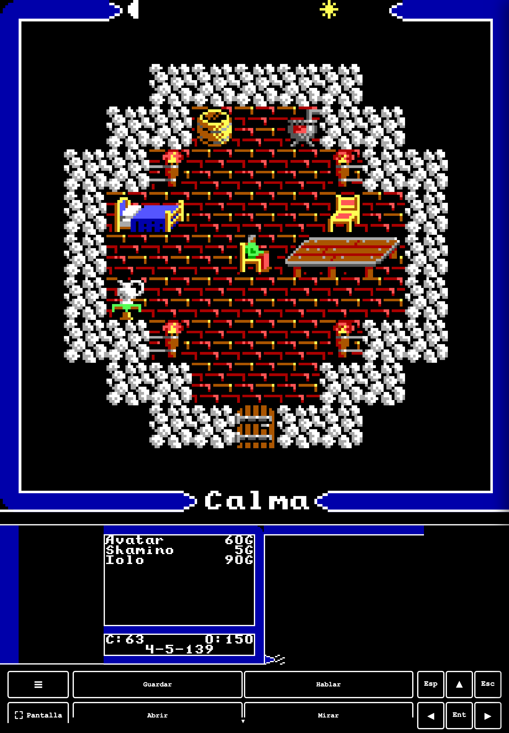
✨ The starting point: the 1988 frame scaled by an integer factor and centred with letterboxing. · By default on desktop
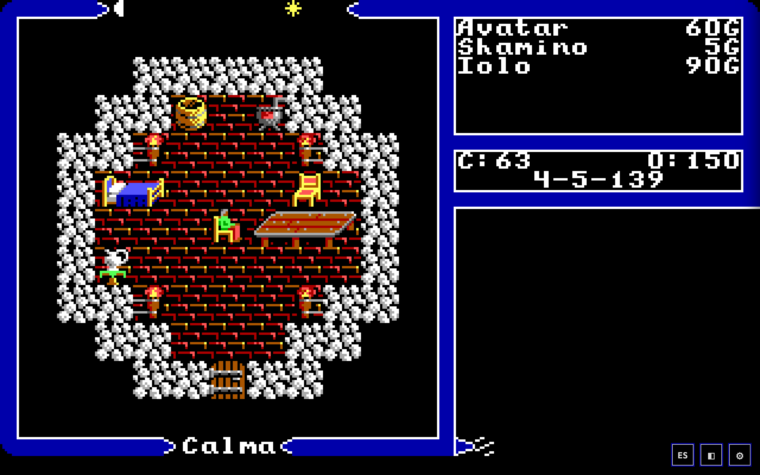
The whole frame is visible: 11×11 viewport on the left, roster with each character's gold, the KPI box (C:63 O:150 and the date 4-5-139), the console below, and the sky and wind bands top and bottom. Bottom right, the three shell buttons: ES (language), ◧ (skin) and ⚙ (SYSTEM menu).
The skin button is ◧, not ▤ (ui/shell/skinSwitcher.ts:79). The ▤ is the LAYOUT one and on desktop it is not in this cluster: it is only installed by the split layout wrapper (
deck-ancho.ts:1535), that is, on touch or with the flag set — which is why there are only three buttons in this screenshot. From desktop the route to the split layout is ⚙ → Video.
What it is for: it is the faithful layout. If what you want is to see the game as it was, this is the one.
2 · Period 4:3 aspect
✨ ADDED · ⚙ → Video → "Period 4:3 aspect (1988 skin)" · Code: game/src/skin/fiel/skin.ts (aspectStretchEnabled, key u5clone:faithful:aspect43)
Stretches the 320×200 to the geometry of a period CRT: everything looks 20 % taller, at the cost of surface.
| Square pixels (default) | Period 4:3 |
|---|---|
| 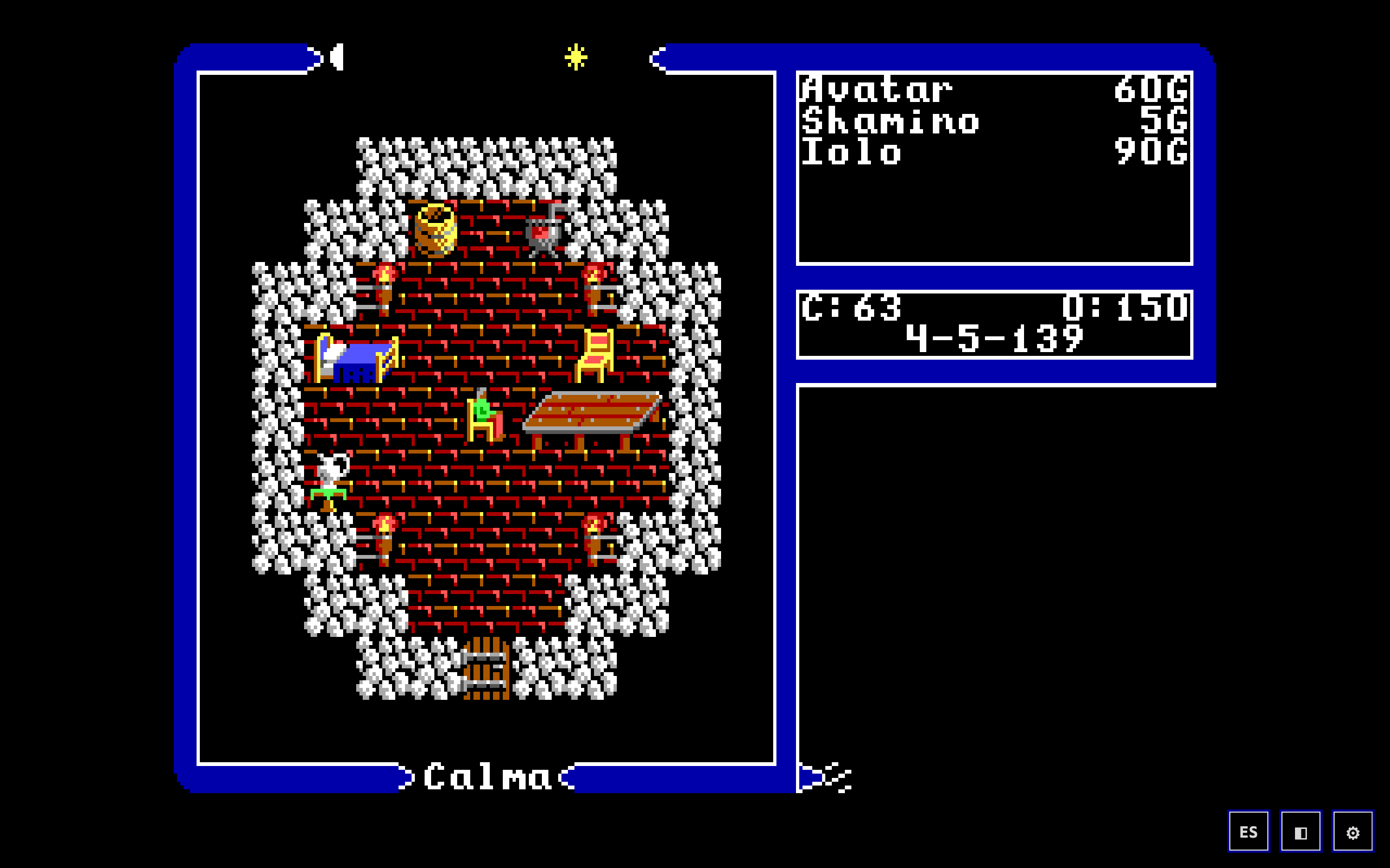 |
A 1988 CRT monitor did not have square pixels: it stretched 320×200 to 4:3, that is, a 1:1.2 pixel. With the box ticked the port does the same, and everything looks 20% taller.
The trade-off, measured
Stretching costs area. In the test viewport (1280×800 CSS) the canvas goes from filling the width to 960×720: the integer scale that fits with the ratio locked is smaller. You gain the period geometry and lose size.
That is why the default is square pixels (decision F-0): most people opening this today expect square pixels, and whoever is after CRT geometry knows what they are looking for.
And one interaction worth knowing
The split layout (§4) ignores aspectY on purpose. On mobile the pixel is square in every panel, and not by oversight: mixing two grids — one stretched in the map and one square in the band — on the same screen looks wrong. The invariant is pinned by a test (tests/portrait-cuadrado.test.ts) demanding a ratio of 1 across the six panels, in both orientations and on the seven devices of the census.
3 · The smooth skin, which is also a layout
✨ ADDED · F9 · ◧ · ⚙ → Video
The same skin filtered by xBR: it moves no boxes, but it changes quite a lot of what you see inside the viewport.
Changing skin does not move the boxes, but it changes quite a lot of what you see:
| 1988 | smooth (xBR) |
|---|---|
| 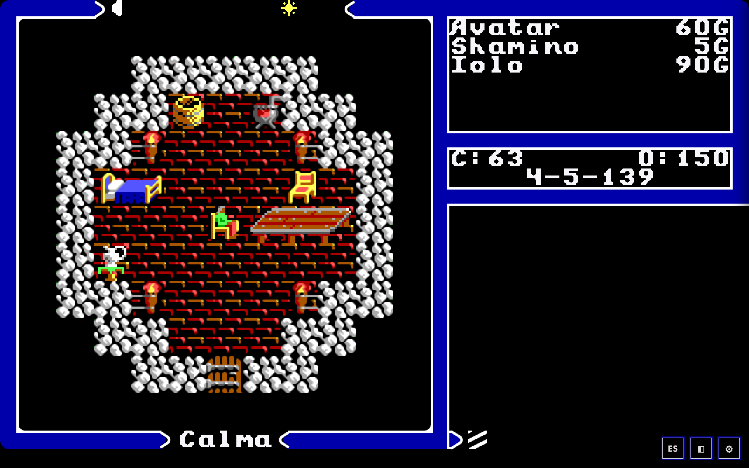 |
The detail that matters when comparing the two: the text is identical. Only the viewport rectangle goes through the filter. The why is in 1 · Image.
4 · The split layout (portrait mobile)
✨ ADDED · Code: game/src/skin/portrait/layout-cuadrado.ts, deck-ancho.ts, deck-nativo.ts · Turned on with the ▤ button or from ⚙ → Video → "Split layout (portrait)"
In portrait the frame splits: a square map at full width, the roster and log band below, the button deck at the bottom.
This layout has a twofold goal: a real full-width button deck, and a map view that is always square, like the original's.
Before / after, iPhone 15 (393×852)
Classic (?reflow=off) | Split (default on touch) |
|---|---|
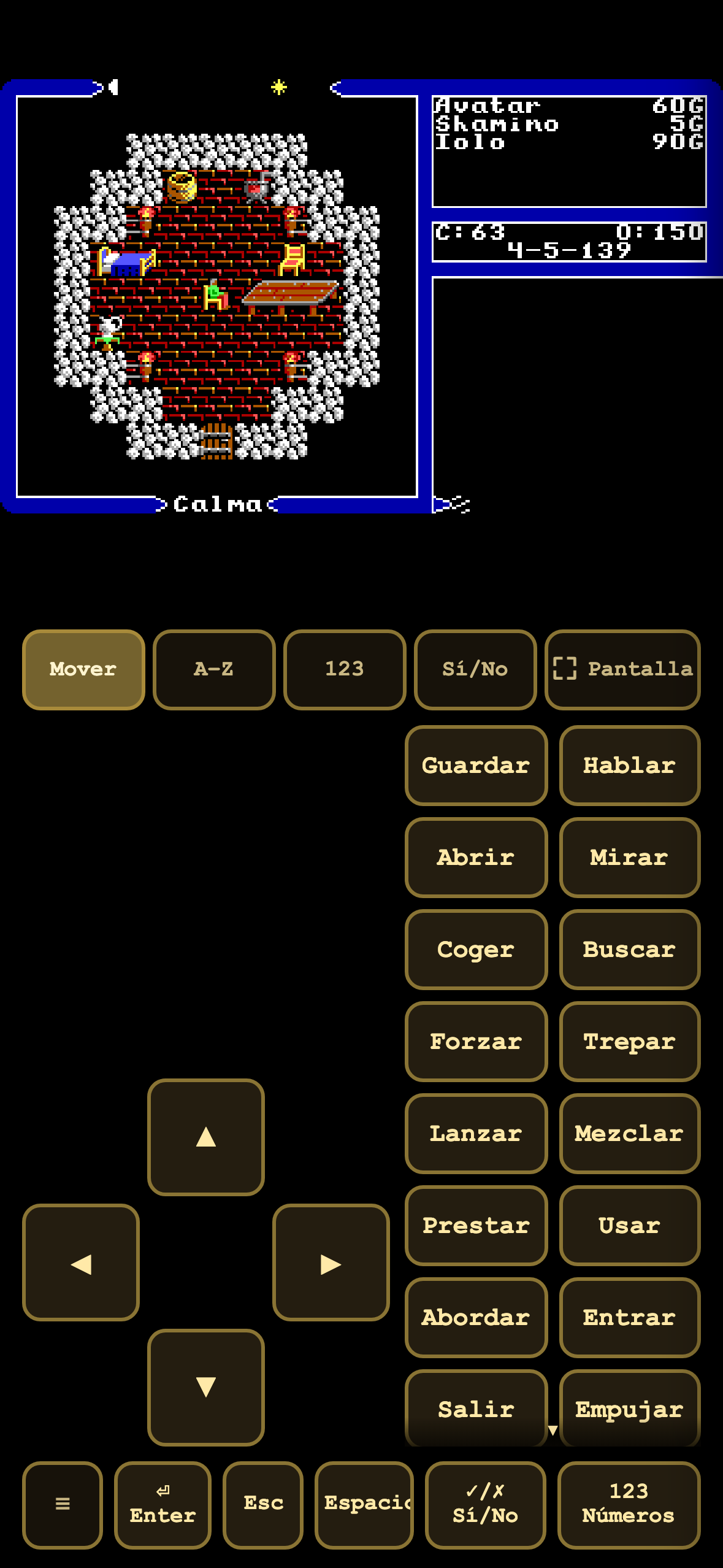 | 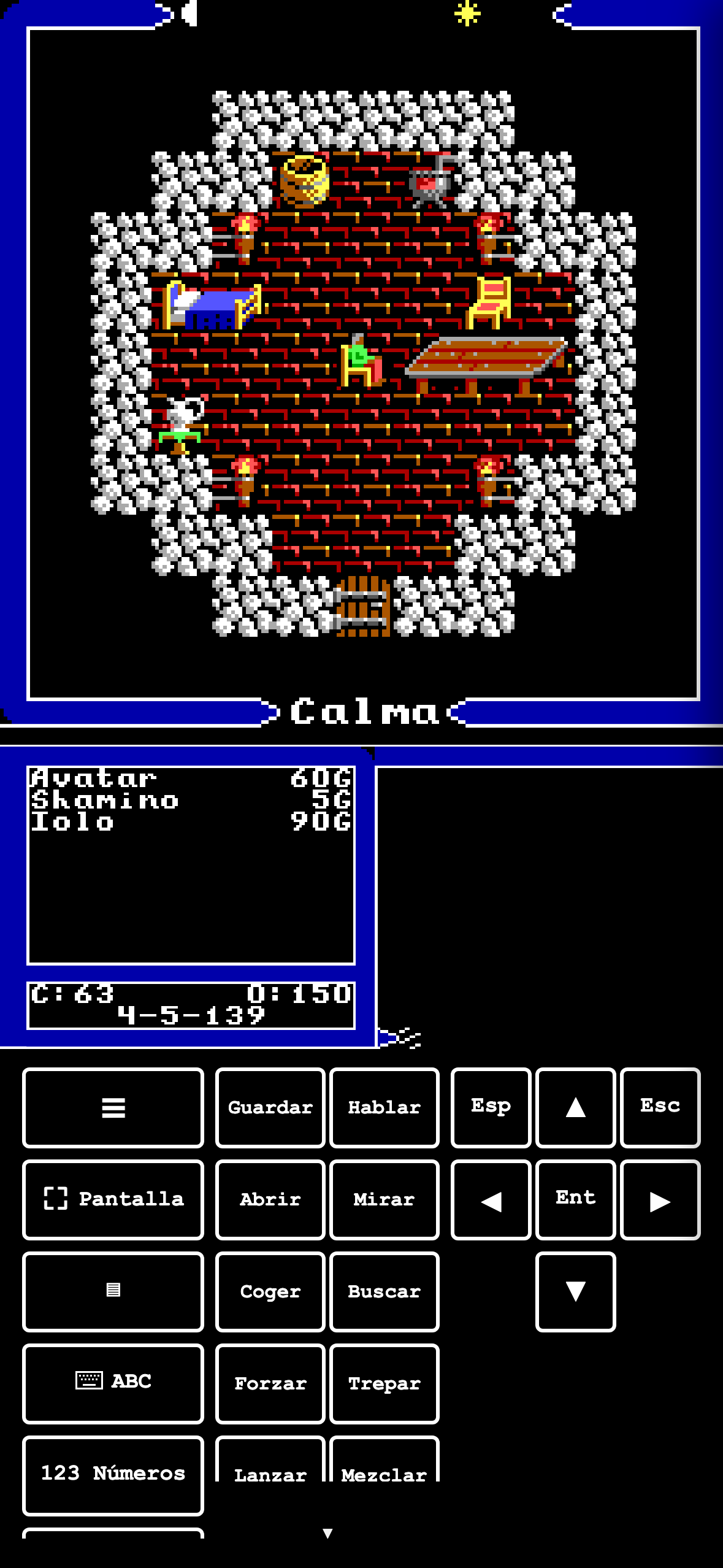 |
In the classic one, the whole 320×200 frame shrinks to fit the phone's width: the map ends up tiny in the top third and the rest of the screen is buttons. In the split one the map is a square filling the width, the player and log band sits below it, and the buttons go at the bottom.
How the square is achieved
With isotropic scaling (sx == sy) on the map block. The source box is already 178×178, so it is enough not to stretch. Zero pixel fabrication: every panel is a rectangle of the faithful skin's canvas, and there is not a single new line in skin/fiel/.
What you can see that is not in the brief: the deck changes too
Comparing the two screenshots, it is not only the geometry. The deck is a different one:
| Classic | Split | |
|---|---|---|
| Look | Parchment buttons, embossed | Monochrome, frame outline |
| Sheet selector | Row "Move / A-Z / 123 / Yes-No / Screen" | Gone: the system keyboard comes in via the ⌨ button |
What no longer differs is the trigger: commands decide as the finger lifts on both decks (see 3 · Experience §2).
The two go together by construction and it is declared that way in the code: the split layout is built around the deck, and the deck only exists where the pointer is coarse.
With the smooth skin on top
| Split, 1988 skin | Split, smooth skin |
|---|---|
| 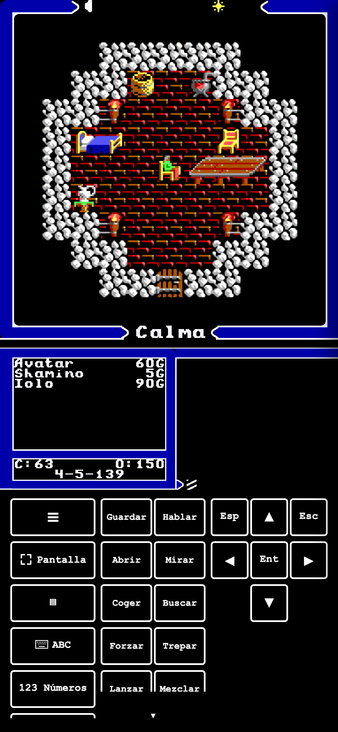 |
Both skins work split as well: the filter only touches the viewport rectangle, so the band, the log and the deck are identical between the two screenshots.
Trade-offs of the split layout
- The gap between blocks is paid out of the deck, not the map. The map↔band separation went from 2 to 6 game pixels on 2026-08-02 at the user's request. It is measured: the original 2 gave 4.1 CSS px on an iPhone 15, of which the two separator lines ate 3 — leaving 1.1 px of black, i.e. visually one block stuck to another. With 6 it is 12.3 px and ~9 of black. And the cost comes out of the deck's budget: the viewport scale in portrait is
W/FRAME_Wand does not depend on the height. - The unit is game pixels, not CSS. The 6 pixels scale with the map, so the gap looks equally thick on an SE and on a Pro Max. And 6 < 8 = the height of a text row: the gap never amounts to a line.
- Without the ▤ there would be no way back. The button that turns the split layout off lives in the split layout's own deck, so turning it off takes the button with it. That is why the ⚙ menu checkbox is not a convenience duplicate: it is the only route that can bring the split layout back, and the ⚙ menu exists in both layouts. It is written as a comment in ui/shell/sections.ts, and it is the kind of detail you only find by locking yourself out.
5 · Landscape
✨ ADDED · Automatic when you turn the device
With the device on its side the game sits centred and the deck splits to both sides of the screen.
| Classic | Split |
|---|---|
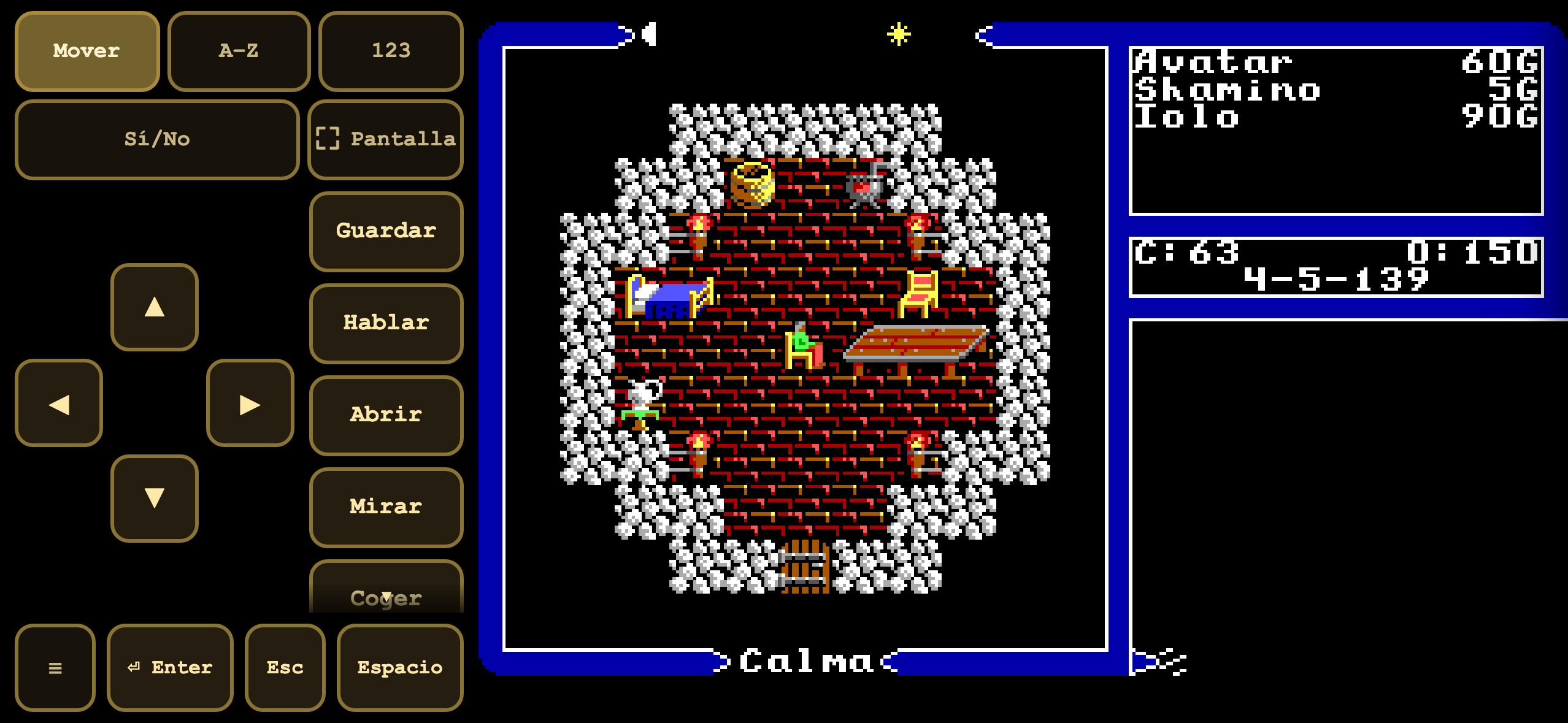 | 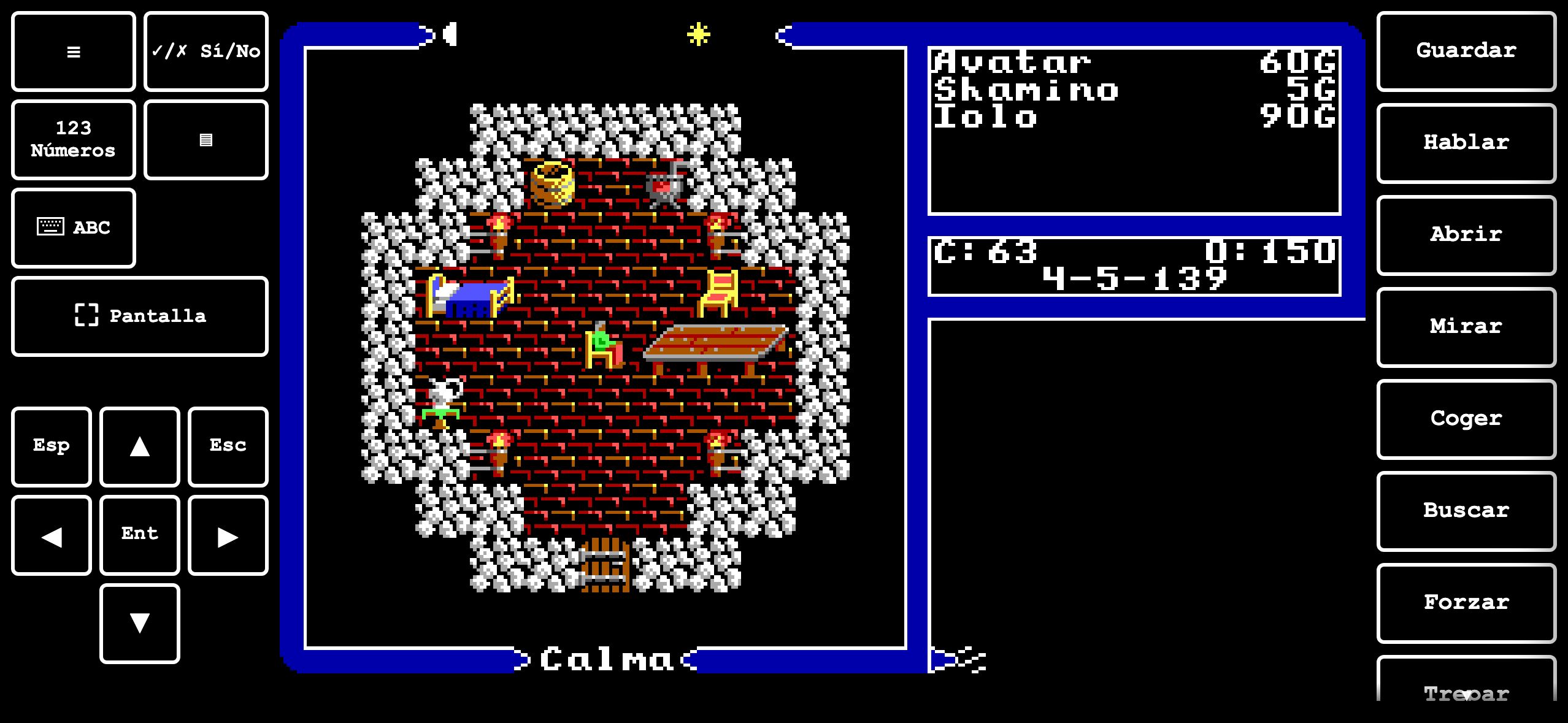 |
In landscape the game is centred and the deck splits up: in the classic one, all the controls on the left; in the split one, two rails — modes and D-pad on the left, commands on the right — with the game in between.
⚠️ An honest caveat about these two screenshots
layout-cuadrado.ts documents a landscape branch of its own: "square map on the left filling the HEIGHT, roster+log band in ONE column on the right". That is not what you see in these screenshots: what appears is the classic 320×200 frame in the centre.
It is not a fault, it is the algorithm working. The composition type (reflow vs clasico) is decided by area: if re-composing would lose usable surface against the whole frame, it stays classic. At 852×393 the classic wins. The landscape branch exists and fires on screens where it pays off (a tablet in landscape, for instance); on an iPhone 15 lying down, it does not.
What does change between the two screenshots is how the deck is distributed and its look — which is difference enough for the choice to matter in landscape.
6 · Tablet, portrait
✨ ADDED · The same split layout: the ▤ button or ⚙ → Video
The split layout with room to spare: the square map fills the surface and the band fits underneath whole.
820×1180. The same split layout, and here you can see what it gains: the square map takes up nearly all the usable surface and the band fits underneath without cramping. It is the size at which this layout is most comfortable.
7 · Fullscreen
✨ ADDED · ⚙ → Video → "Fullscreen"
Toggles browser fullscreen, and never throws: without support it is a silent no-op.
⚙ → Video → "Fullscreen". Toggles document fullscreen and never throws: without browser support it is a silent no-op (explicit try/catch in ui/shell/sections.ts).
It is not illustrated here because a fullscreen screenshot in a headless browser is indistinguishable from the one above: what changes is the browser chrome, not the game.
8 · Where all of it is changed: the SYSTEM menu
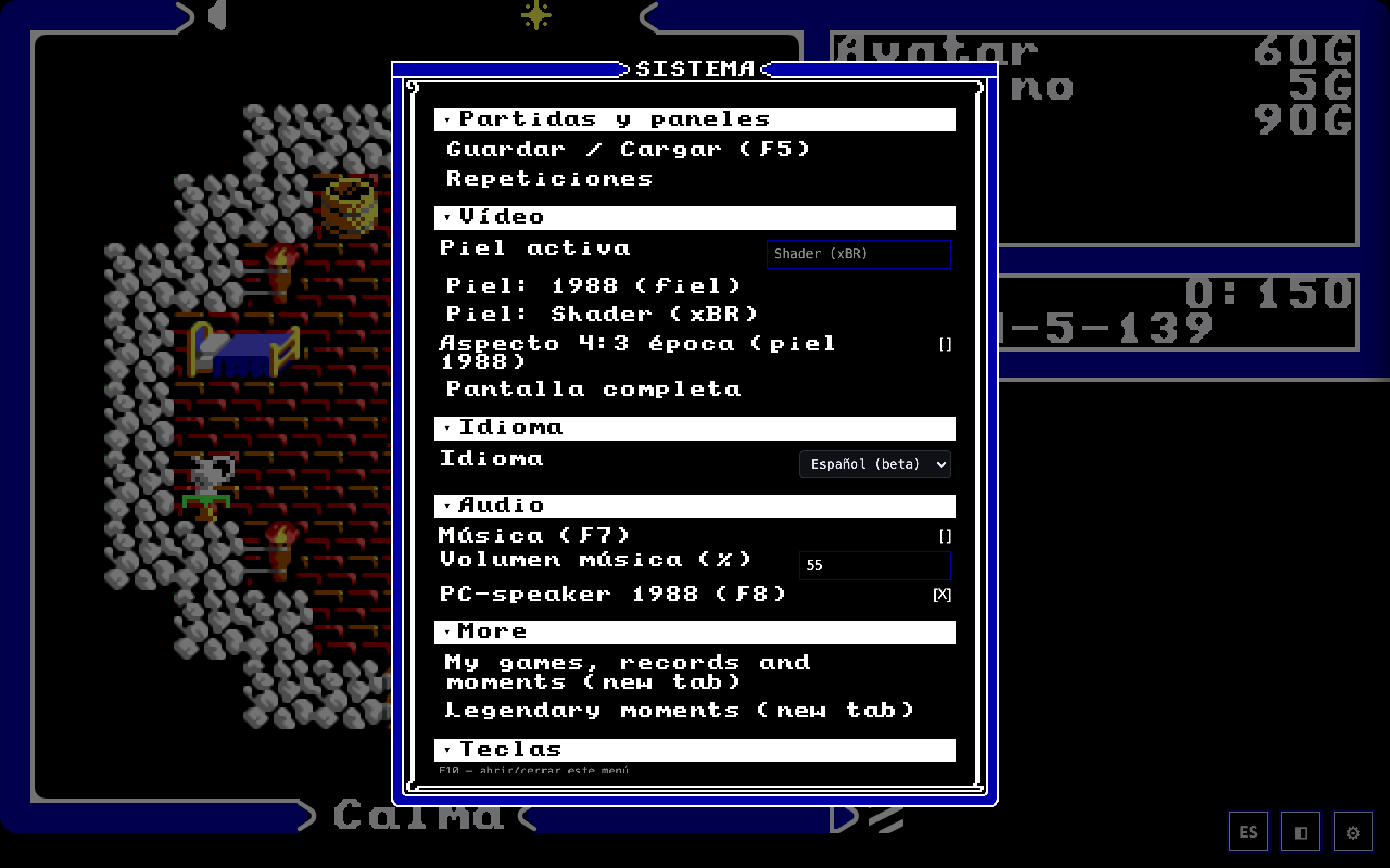
The menu opens with F10 or the ⚙ button (and on touch, with the deck's ☰). Sections (measured live on 2026-08-24): Saves & panels · Video · Language · Audio · More (games, records and moments) · Keys · Commands (original) · Help · Privacy · Debug (QA).
Three design details visible in the screenshot:
- It is drawn with the game's EGA chrome and 8×8 font, not with modern widgets. That is decision #23 (2026-07-20): the "1988 window" became the default under both skins. The rounded vector look survives only as a QA fallback behind
?shellVector=1. - The Video section lists the skins as buttons, one per skin, with the active one shown above under "Active skin". There is no dropdown: one click jumps to that skin through the same persistence path as F9.
- The "Split layout" checkbox does not appear in this screenshot, and that is correct: it is only drawn if the split layout exists in the session (
layoutPartidoDisponible). On desktop it does not exist, so the row is not offered rather than offered greyed out.
The ⚙ and why it fades
The button fades after 4 seconds without pointer movement, so as not to clutter the view of the 1988 skin. But on touch screens (pointer: coarse) it stays always visible: without a keyboard, it is the only door to the menu. Two behaviours, and the reason for each is written in the header of ui/shell/gear.ts.
Trade-off: on desktop, the shell's only visible affordance disappears by itself. Anyone who stops moving the mouse while looking at the screen is left with no hint that there is a menu at all, and F10 is not self-discoverable — which is, literally, the reason the button exists. Visual cleanliness is bought with discoverability, and the payment is in the scarcest currency there is: a new user's first minute.
The menu's own trade-off: coherence was chosen over legibility
Drawing the menu with EGA chrome and an 8×8 font (decision #23) costs something real: an 8-pixel bitmap font is less legible than the vector typeface that was there before, especially in the small help lines. The screenshot above shows it — compare the section titles with the "Keys" rows.
It was decided in favour of coherence ("the 1988 window" under both skins), and the vector look was not deleted: it survives behind ?shellVector=1 as a QA fallback. That a way back was kept is the sign that the trade-off was acknowledged when the decision was taken, not afterwards.
What this document does not cover
- The cursor side (left/right, right by default "for right-handers",
deck-nativo.ts:ladoGuardado) — it is a deck preference, not a layout. - The companion / atlas, which opens in another tab and therefore has no layout of its own inside the game. What it is and what it does is in 3 · Experience §7.
- The intro cinematic, which runs before any skin is mounted and has no alternative layout.